Choosing the Right Paint Colors for Commercial Buildings
When it comes to a commercial business, sometimes, what you see is what you get.
Frankly, first impressions can make or break a business. And nothing gives out a positive image like a well-maintained building, including the interior and exterior painted with the right colors.
The easiest way to create the right palette is to consult a professional painter, like East Valley Painters. However, using a helpful guide that covers as many different aspects of painting your commercial business is a great idea too.
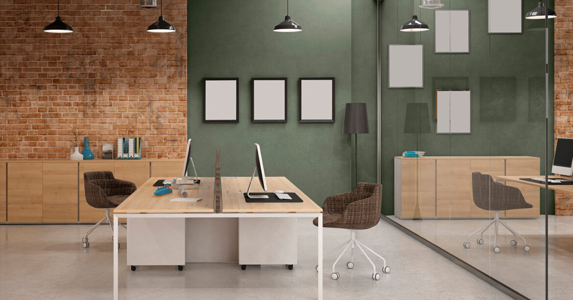
There is much to consider when choosing a suitable color scheme for your business or office. Depending on the nature of your business, you should be mindful when picking color combinations for the interior and exterior of the building.
Go Bold When Painting Your Commercial Building
Brand colors should always be in top consideration, but they are not the only thing that should be used as a reference when choosing the colors of your commercial building.
If your business is looking for vibrant and energetic colors, look at reds, oranges, and yellows, which are more likely to grab consumers’ attention. These more intense colors also initiate an emotional response and accelerate consumers’ decision-making by encouraging them to walk into a business.
Blues are an excellent choice for retail department stores, while hues and tones of pink and purple can bring a spark of vibrancy to things like boutiques.
Darker colors, such as black, especially in combination with gold, are commonly used for high-end businesses and stores. It is a distinct and daring choice, so think twice before the painting starts.
However, some commercial areas, especially historical ones, have regulations that limit color choices. Be mindful of this and respect any district’s architectural or landscaping standards.
Consider Color Psychology When Painting Your Commercial Building
 The colors of the walls in your business establishment set a tone. The colors in our surroundings can powerfully affect us by triggering various feelings. This is why it is essential to consider how the colors in your business will affect consumers in multiple ways. Even studies have shown that there is a psychology behind choosing the right color palette for your commercial business.
According to a study by researchers at the University of Texas, neutral colors such as whites, grays, or beiges should be avoided since they can increase depressive feelings among visitors and employees. Instead, consider using hues that are an extension of your brand’s colors. It will significantly improve the gloomy aesthetics often used in facilities and make the brand easy to spot among visitors.
Scientists at the University of British Columbia recommend reds for spaces looking to achieve great attention to detail. At the same time, earthy tones are great, ideally if you aim to build authenticity around your brand.
Get a Free Estimate from East Valley Painters
Ready to update the paint of your commercial business? Call up East Valley Painters to schedule a consultation today. We take pride in using only professional-grade paint and techniques. Just click below to contact us or to learn more about our painting company. East Valley Painters, serving Sun Lakes, Ahwatukee, Gilbert, Chandler, and east valley cities for the past 30 years.
Photos Source